Tuesday, May 3, 2011

Extra Credit

 This is a shot where I have the figure (Little Dan) hanging from what seems to be high point.
Here we see Little Dan climbing into his favorite snack, Triscuits. He just can't seem to get enough of them. This is another shot I took today, to supplement the two that I had already shot.
 Little Dan is dangling over the edge from a coffee mug. I also shot this today to add to more of the group shots.
The final picture is of Little Dan attempting to climb some very daunting stairs. It almost seems like they could be going down, which was unintentional but is also interesting, since it plays with linear planes.

Why do I always forget to post these?

 This is the beginning of my little story, which starts with me reading over my schedule for the week.
 The next is when the lists start to flow on my hand, to which my hand resists.
 More text is pouring out, and my hand gets more agitated.
 The full coverage is laid out, as well as some sort of acceptance of what has happened.
 Then comes the marker, which starts checking off what has been accomplished.
 More things are getting crossed out, including things on my hand.
 The final "mark-down" (very punny)
 Washing away the evidence of all of the stress and turmoil of the week.
Finished!

The project was kind of a personal reflection of my stress level and how I've been trying to deal with it. Its not really an exaggeration, since I was pulling from lists that I myself had made over time. The photo set is like some sort of victory so it is supposed to have a more positive tone than the practice photos that I had previously made. The process itself was kind of frustrating, since I had to rely on both tripods and my boyfriend to take the pictures. Self timers can get to be extremely tiresome, and boyfriends can't ever keep shots in focus. I think that I am going to invest in one of those hand held shutter things so that if the situation ever arises again that I will be more self sufficient and sane.
After the class critique, someone pointed out that I should switch the last two for a better flow. I'm not sure if I completely agree since I think it might be weird to have something say 'all done' and then have an additional photo follow it, but it was interesting to hear another person's opinion.

Monday, April 25, 2011

Blog Prompt #26

Brainstorms! (In an effort to expand, improve, add complexity, and push your final projects further, please pick 10 of the following to discuss.)
  1. Ideas sometimes grow out of irritation. What is a negative thought you are having about your project? What is the opposite of this negative thought? How could you implement a change in your project so that this negative thought will subside? One thing that keeps on recurring to me is that I am going to have to keep on rewriting and rewashing my arms and hands in order to show the progression of different days. I've been playing with the idea of using a projector, but mine isn't powerful enough to work in a room that isn't completely dark. I could rent one but since this is a project that is going to require multiple shots,  I'd have to try to do it all at once. 
  2. What is the “opposite” of your final project? How can you rework your project to include the “opposite”? If I were to do the opposite, I guess it would be a sense of being underwhelmed. Something like not having enough to do. I think it would rely more upon my facial gestures rather than the lack of writing on my hands. 
  3. What is a consistent theme/visual element in your project? What would be the opposite of this? How can you implement that into your project? Since type and my body are constant figures, I think that to oppose it would be to draw pictures of the actions? I'm not really sure how well that would correlate. I could take pictures of my planner however, since that's where I jot everything down most of the time. I generally reserve my hands for when I have something that needs to be done right away.
  4. Type twenty words or phrases that relate to your project. stress, school, schedule, over booking, overwhelmed, depressing, tiring, never ending, busy, struggling, pressure, in need of help, EIGHT MORE
  5. At the deepest core, describe why you like this project. Dig deep! I am really struggling to put myself into my work, so I like this project since it is so personal to me. I have always had a lot of independence kind of thrown on me, but lately it has become almost overwhelming. My family has been going through a very difficult time, so I have been struggling with trying to maintain my presence at home all the while keep up with my school work, social life, jobs, and even just living on my own out of the dorms for the first time. I have to maintain all of these lists of tasks to do because I can't ask my parents to help me, since they are wrapped up in their own problems and probably need to me to help them out more. I have all of this pressure to succeed with school and still be supportive for my family, so it is proving tough for me to keep up with everything. 
  6. Expand your project. If time, money, materials, etc would not affect you, how would you expand your project? If I had more resources, I would probably expand this to other people. I think it would be interesting to see some of what others go through on a daily basis and that everyone has their own problems and endless to do lists. Or even that some people are just more successful at keeping a simpler kind of lifestyle, which is something I am trying to go for. 
  7. Contract your project. What would it boil down to if squeezed and contracted to its simplest form?
  8. Look at one of your images. Redesign it entirely. Project hands on lists! 
  9. Divide your project into three components. Rearrange and reassemble them in your mind.
  10. List your assumptions about your project. Reverse these. I assume that my project will be kind of sad, and if I were to change that I guess I would need to put more humorous things on the list to keep it lighter. All of the stuff that I put on is pretty straight forward, but out of context it can be kind of funny, so if I emphasis that a bit more it might make the project a big lighter.
  11. What would your project look like 100 years ago? What would your project look like 100 years in the future?
  12. Remove something from your project. How does it change?
  13. Persuade the reader that your project works well and is the most amazing project you have ever completed.
  14. Persuade the reader that your project stinks. Then, persuade the reader that you will make changes so that it no longer stinks.
  15. Think of one of your most memorable dreams. How could you add elements from this dreams to your project? As far as dreams go, I generally wish for a simpler life. Something where I don't have so many material objects and where I am free from many of my mundane responsibilities. If I where to incorporate this into my project, I would make lists of things that I want to do instead of what I have to do and I could show myself happier. I could even play with a long shutter speed so that it has an airy feel.
  16. How would you convert your project into a narrative? How would you remove any narrative from your project?
  17. How would you connect your images physically and conceptually? How would you make them disconnected physically and conceptually?
  18. What would happen if you demolished your project and reconstructed it physically or conceptually?
  19. Name an artist/photographer/designer/videographer who would love your project. Why?
  20. Name an artist/photographer/designer/videographer who would hate your project. Why? Probably anyone, since it is probably going to come off as whiny. I am fortunate enough to be in a university so I shouldn't really be complaining since my problems are mostly self inflicted and could be much worse. Its normal to be overwhelmed by growing up and taking more responsibility for your own life. Its just all a new experience for me and it is a lot more than what I had bargained for. 
  21. How would you make your project more edgy, saccharine, provocative, empty, revealing, concealing, funny, sad, mysterious, blunt, honest, disingenuous, fast, slow, playful, austere, hateful, lovable, bold, subtle, long, short, big, small, connected, disconnected? I guess that would come from the chosen environment. I could go with a simple backdrop, but if I play more with what the background means it could relay better onto the concept.

Tuesday, April 19, 2011

Assignment Five


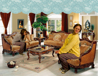
These photos are meant to be seen as a set. I first photographed my boyfriend, Dan, attempting to climb trees around campus. I then played around with photoshopping him in different environments, which you can see in earlier posts. I am not very comfortable with Photoshop, so I shied away from using those images. Hopefully over the summer I will be able to cultivate my skills using the program so when I take more photo courses I will be able to take advantage of all of the possibilities that would open up. ANYWAYS, I decided to try printing out some of the better shots from the shoot. I started playing around with ideas, and then came up with this concept. I like that it plays not only with scale but also opens up ideas with the context. It can be used humorously or can implicate the struggles with modern living, i.e. consumption/consumerism. That all depends on the surrounding background, so it takes more thought to figure out how it should (hopefully) be perceived. Overall, I am happy with this series and I would like to push it further in the future. 

After the class critique, I got some helpful tips. They liked my series and saw it more humorously. They suggested adding in different poses and even work more with the shadows so that it gives more of the illusion of dimension. There are lots of different ways I can go further with this set.

These photos came from the scanner. I was experimenting with it, and these were the results. I got the first by dragging the watch over the light, and it made this really nice distorted effect. It became surprising colorful and an interesting look about it. The second came about by accident. I was uploading one of my experiments into Photoshop, and the canvas was way too small for it. The result was a close up crop of one of the watch faces and I really liked how it turned out. I tried to rescan it at a higher resolution but I could not get it to work. To combat this, I just stacked multiples of the same image and presented it that way. I think that these are interesting since there are so many connotations with watches, especially time. With the altered states, it kind of distorts time and can say about how it is fleeting, or how it can be repetitive (as my professor pointed out). The class also pointed out in the critique that I could have upped the contrast, which looking back probably would have been a good idea.

Tuesday, April 12, 2011

Works in Progress Critique

gif from Dan's attempts at climbing the tree.
I'm considering altering the background to disorientate it from the normal view.
Another possible background alteration.
I like how it looks like he ran into the tree

This was from playing with the scanner, to which I dragged the watch's face across it.

This was more experimentation with the timing of the scanner.

Sunday, April 10, 2011

Blog Prompt #25

You as Curator
Look through the list of recent entrants to this call for photography. 
http://pdncuratorawards.com/entries.shtml
Pretend you are curating a show and choose 7 photographers to include in your show. Describe why you would pick those particular artists and what about their work stands out to you.


Albert C. Karges
I liked how his images related to each other. The emphasis on the horizon line was very interesting, and I liked how he had the landscapes turn into almost solid rectangles. 


Patrick James Michel
His work was very enchanting. It has the allure of a modern day woman captured in the style of the old painting masters. I am drawn to the interesting style and compositions.


Naomi Elena
Although she only had one submission, I really felt a connection to the solitary photo. It conveys a lot of sadness, with what I picked up as themes of loneliness, self image, and emptiness. It is quite moving.


Alyssa Miserendino
Many of the photos were of nature interacting with man made structures. It is very interesting to think about how we try our best to control and keep out nature, but it is inevitable that nature will win.


Oksana Mansour
I liked the playful nature of these photos. They seemed to tell a story, and the sets that surround them are very involved and lovely. 


Charles Latham
I love how beautiful and eery the sky is captured in his photograph. It has a very serene feel, and it is calming to look at. Although I necessarily would not want to be in that location (since I am a big chicken and would be on my wits end) I can definitely appreciate it.
Linda K. Robinson
I really enjoyed how her photos made me look again at everyday objects. I like the use of linear cues and the lighting is serene. Its a lovely look at something oftentimes overlooked.

Tuesday, April 5, 2011

Assignment Four


For this project, I approached it more as a set. The goal was to look deeper into the process of getting a perfect shot. I contrasted what I considered to be a typical, normal fashion photo with the model running into problems with the environment.
For the first two, the location came as an accident. I was planning on shooting outdoors on campus, so I parked my car in the parking structure. Luckily for me, the lighting happened to be AMAZING and was projecting the beams of the lot onto the ground. We set up there to start shooting and got some really good images. My model was fully committed to falling and we kept pushing that aspect of the shot until her leg got sore.
After I felt safe with those shots, we went over into the field across from the Union. We found a good spot to shoot the other two with little distracting factors. I had to shoot her backlit so that my shadow wouldn't get into the shot. The photos are actually quite beautiful in color too. Overall, I think that I got the shoot to go well and was very fortunate to have my model (my wonderful best friend Katie) be so willing to take direction.


After Critique
A few people told me that it seems less like fashion photography than I had hoped. They said that there should be more emphasis on the clothes as opposed to the sets, but the overall response was positive. They also recommended printing out the bottom two in color, which I did not disagree with, but I didn't pursue because I didn't want to disrupt the set. Thinking back, I think that I should have printed out larger on 8 1/2 x 11 so that it would be closer to the size of a real magazine. However, I am happy with the prints and I will probably use them as portfolio pieces.

Blog Prompt #24

A. Pick two images from any of the “constructed reality” photographers presented in class or linked on the assignment sheet. Describe how you could recreate these two images on a “smaller scale”.
 I think that it will be interesting to try to reconstruct the work of John Heartfield by inserting in more modern people that exemplify some of the natures of the people he was critiquing. It would be done more as a collage, so I would be working more with the scanner that the camera. If I were to recreate Henry Peach Robinson's Lady of Shalott, I think that I would do it by constructing a set similar to the original but with all artificial materials. I would use fake plants and water and even use a barbie doll as the central figure.


B. Describe your plans for your self-proposed final project (if the plan is the same as before, paste it here again and give a bit more detail). During the final critique for Assignment #5, you will discuss/present these ideas to the class.
I think that for my final project I will reshoot and work more with the idea of making lists and becoming overwhelmed. I make my own to-do list for each day, so I will start writing it over my hand to try to get an idea of what I do each day. Some days are more stressful than others, so I think it will be interesting to see the difference. I am even thinking of playing with light projection by projecting my lists upon myself or my friends by using their own to-do lists.

Thursday, March 31, 2011

Blog Prompt #23

This is long overdue. 
1.     In what ways do you “construct” your identity? In what ways do you “perform” in your daily life?
        I think that people construct their identities by choosing anything specific to their outer appearance. Everyone has certain connotations associated with this everyday things, like the way hair is styled or the way make up is applied or even the clothes we wear. People have an idea of who they think they are so they try to appear to fit in that personal view of themselves. It doesn't always transcribe the way that people desire. We perform our daily lives by trying to fulfill these personal missions of what we see ourselves to be. 
2.     Describe some ways in which your personal culture and social environments are “constructed”.
        I really can't think of anything further than the actual act of constructing something, like building it. Maybe its more of the way that we arrange and accumulate these items into our lives.
3.     Describe some ways in which your physical environment/space is “constructed”.
        The environments that are constructed are usually intended to serve some sort of purpose (or even purposelessness.) They somehow serve a function, and it can be used to cater to any sort of whim.
4.     In your daily life, what would you consider to be “real” and what would you consider to be “constructed/fabricated”?
        I think the things that I consider to be real are the things that are tangible. Anything else is fabricated in some sort way, whether is natural or unnatural.
5.     Describe a narrative tableaux that you might create to be captured by a photograph. A narrative tableaux can be defined as “Several human actors play out scenes from everyday life, history, myth or the fantasy of the direction artist” ( Constructed Realities: The Art of Staged Photography Edited by Michael Kohler , 34).
        I think that it will be interesting to shoot pictures during a play. Then it would be up to the discretion of the photographer to try to capture the best moment that embodies what the play is about, or even just a memorable moment from it.
6.    Describe an idea for a photograph that includes a miniature stage or still life. A description of such an image is “The tableaux reconstructs events as in the narrative tableaux, but in miniaturized format, using dolls and other toy objects” (Kohler, 34).
        After reading this prompt I immediately thought of my childhood and how I used to play with Barbies. I would make up these elaborate homes for them. Since I didn't have all of her accessories, I would substitute items and use things that I had around in lieu of the actual licensed Barbie products. I think it would be interesting to try to reconstruct some of these sets.

Recreation #5

For my recreation, I decided to try to emulate the work of Barbara Kasten. A lot of her work involves constructing sets or altering permanent ones in an impermanent way. I decided to try it myself, and I simplified my set construction much more. I really wanted to try and pull out some shadows from the wire structure, so I added in a lamp to have more direct lighting. I also wanted to make sure there was a lot of contrast, so I used a light background to best show the darker shadows that were being projected upon it. The actual set itself was a foam core board, my glass palette, a wooden dowel, and a record holder. I wish that the glass wasn't so matte, but the backside of it is gesso'd so I guess that is all part of constructing my own set.

Barbara Kasten


Kasten was born in Chicago in 1936. She received her bachelors degree from the University of Arizona in 1959 and got her masters from the California College of Arts and Crafts in 1970. Kasten has a very long and impressive list of awards, grants, and showings. The complete list is here.

Kasten photographs elaborate sets that she herself creates (along with a lighting team she recruited from the film industry.) She stages the use of mirrors, glass, shadows, and a large assortment of mixed medias. Kasten also shoots site specific photos, but she usually incorporates the use of mirrors and vibrant colors among them. She creates surreal environments that explores their alterations by juxtaposing harsh, extreme lines, angles, and forms. She was also influenced by the Bauhaus Movement as well as Constructivism.

As far as finding any sort of artist statement, I couldn't really find anything. I'm not sure as to what her motivations are, but I really enjoy her work. I find myself trying to piece together how she created some of her photos and come up short. I really like that her pieces have a simple, yet at the same time complex use of line and shadows.

These links were the most useful:
http://www.mocp.org/collections/permanent/kasten_barbara.php
http://barbarakasten.net/